Color Companions: The Best Colors to Match and Color Combinations to Avoid in your Home
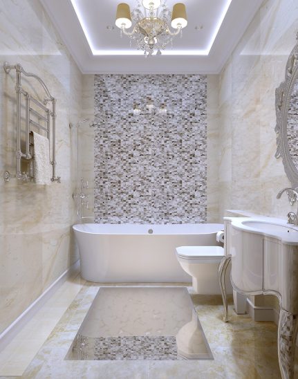
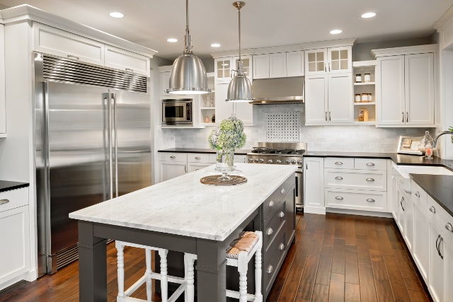
Some colors go together like bread and butter. A chocolate crystal granite countertop with soft beige walls? A winner for sure. Beautiful marble walls in white wooded bathroom? Genuis!
But what color should you paint your walls when you want a bold countertop or floor color? Picking and choosing the best color combinations can be hard.
With so many color combinations to choose from and trends constantly coming and going, you’re going to need a little guidance when it comes to choosing the right ones. This blog is looking at the best colors to match your home, and show you which color mistakes to avoid!
The Best Color Combinations for your Home
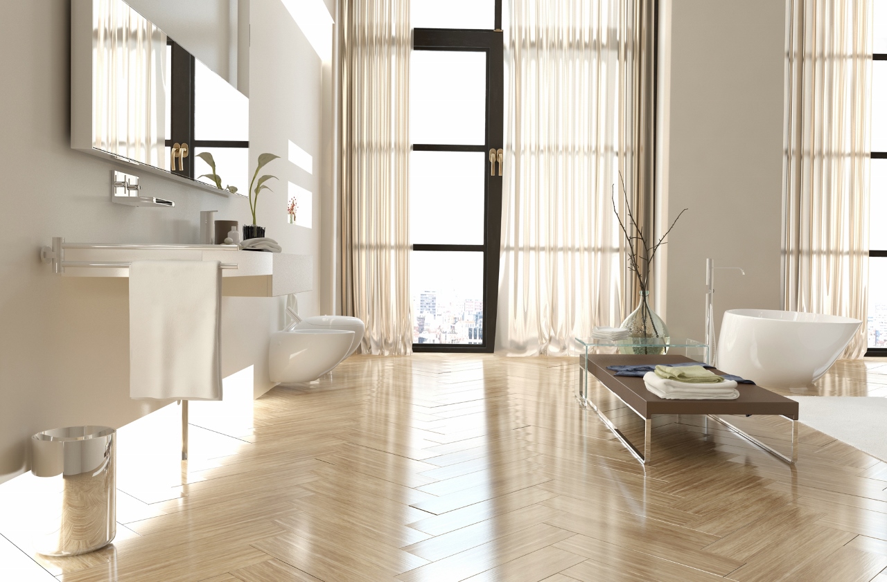
White and Grey: White is a trending color when paired with nearly any shade of gray. This fantastic combination makes your home feel new and expensive and goes with nearly every style of home décor. Always make sure that your whites and greys are in the same color palette so you don’t accidentally mix a warm white with a cool grey.
Turquoise and Cream: Do coastal the right way by pairing warm creams and soft chocolates with tasteful pops of turquoise. This makes a room feel clean and bright, yet warm and inviting.
Succulent Colors: If you are looking for a colorful color combination without going over the top, look to succulents for the perfect palette. These little plants provide great inspiration with their soft greens and blues, warm purple, and pops of muted lime green. This combination is a winner for choosing fun, mature shades that burst with a pop of color.
The Worst Color Combinations for your Home
Green and Red: Great for season’s greetings, but not so eye-catching in the home. Pairing green walls with red accents or vice versa can make your home feel dated.
Circus Colors: Vibrant hues such as lime green and bright purple may sound good in theory. After all, they are colorful shades that make you happy. However, pairing a bold color with another bold color is… well, too bold. Neon palettes should be avoided in the home, save for your little one’s bedroom. These bright palettes are highly stimulating to the brain and can be hard on the eyes. If you adore the idea of a bright, vibrant room, stick to neutral bases with pops of bold colors in accents such as curtains and throw pillows.
Rooms that are Too Dark: Taking a room with dark wood trim and pairing it with charcoal walls is a terrible idea. Pairing dark with dark makes your room appear smaller and brings down your mood emotionally.
You want your home to look and feel tasteful, so it’s important to see the best and the worst color combinations up close before you make your final decision on how to decorate. Study your home and the type of flooring, trim, and overall design it has before you choose the best color combinations to match.
You may also be interested in
Home Design Trends for 2015
With the hustle and bustle of the holiday season in full swing, nearly everyone has the same goal…closing out the 2014 year with a celebration and then beginning the 2015 chapter with style and pizazz. Here are some of the hottest home design trends of 2015 to get you started! Bold, Warm, &…
Determining the Right Kitchen Layout for Your Remodel
Your kitchen is the hub of activity in your home, so having the luxury of designing how you want this space to flow is an important task. Function, food, and friends – these are the three F’s to consider when remodeling your kitchen. Why? Because the style and kitchen layout will determine how you’re going…